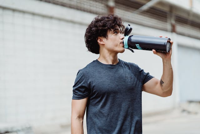
Design Cans That Pack a Punch, Just Like Your Energy Drink
Ever picked up a can just because it looked cool? That wasn’t by accident. Smart can design plays a huge role in how products stand out and connect with customers. If you’re in a crowded market like energy drinks, your packaging can make or break someone’s decision to grab yours off the shelf.
It’s not just about making it look good. The right design gives your product personality. It shows off your brand’s vibe, grabs attention in seconds, and speaks to the exact audience you want to reach. Let’s break down what it really takes to create a can design that delivers the same hit as the drink inside.
Table of Contents
Understand Who You’re Talking To
If your drink is made for night owls, fitness buffs, or gamers, the can should reflect that. Your audience isn’t just anyone who’s thirsty. They’re people looking for a jolt of energy, a sense of identity, maybe even a lifestyle.
Before you get into colors and typography, get crystal clear on:
- Age range
- Gender (if relevant)
- Where they hang out or shop
- Their hobbies or daily routines
- What kind of energy they want, i.e. mental focus, athletic power, or late-night fuel?
A slick, minimal matte black can might hit the mark for an edgy, serious gym crowd. Bright neon gradients with chaotic graphics? That’s better suited for festival-goers or gamers. What matters is aligning the design of your energy drink cans with what your audience already loves.
Think Shelf Impact First
Your can will be sitting on shelves or inside fridges, surrounded by dozens of others. That moment, when someone glances over and decides which one to reach for, is where shelf impact matters most.
The goal is to grab attention fast, even from several feet away. This is where design clarity comes into play. A common mistake is packing the can with too much: too many colors, fonts, textures, or visual noise. Instead, focus on a single strong idea. Whether it’s a bold color palette, an oversized logo, or an unusual layout, the design should guide the eye immediately to what matters.
Contrast is especially important. High contrast between your background and text makes sure your message doesn’t fade into the noise. And the layout should feel clean, not cluttered, with a clear hierarchy. Your brand name, flavor, and main selling point should each have their own space to breathe.
Also, think about how your can looks in real environments. In a dimly lit fridge, under fluorescent store lights, or stacked next to competitors, does it still stand out? Always test your design in realistic settings before finalizing anything.
Color That Communicates
Color choice isn’t just aesthetic. It’s functional. The right color palette tells people what to expect before they even read a word. Red might suggest something fiery or fruity. Green often hints at a more natural option. Metallic finishes can signal premium, while neon tones speak to high energy or playfulness.
But it’s not just about signaling flavor or mood. Color also becomes part of your brand recognition. If you choose a signature color scheme, people should be able to spot it instantly, even across the room. And while it’s tempting to go wild with gradients or effects, keep in mind how colors translate to print, especially on aluminum. Some shades may look vivid on screen but dull or shift when printed.
Consistency across your product range is also key. If each flavor has a different color, make sure there’s still a unifying system. That way, your brand feels cohesive, even with variety.
Fonts That Do the Heavy Lifting
Typography might not seem like a big decision, but the wrong choice can confuse or alienate buyers. Fonts should be easy to read, even on a curved, sometimes damp surface. That’s especially important for core information like the flavor name, your brand, and any functional claims.
Think about the personality of the font, too. Sharp edges can suggest speed or intensity, while rounder, softer letters might feel more friendly or fun. If you’re aiming for bold and high-energy, go for confident, high-impact lettering. If you’re offering something more refined or wellness-oriented, a lighter, more modern font may suit better.
Hierarchy matters here. Your most important message should pop instantly, whether that’s the flavor, your logo, or a unique selling point. Supporting text should complement, not compete. Don’t overload the can with multiple font styles that clash or distract. A well-chosen type system will tie the whole design together.
The Power of Your Logo
Your logo is the anchor of your design. It’s what people remember and what helps them find your product again. Make sure it’s easy to spot, clearly placed, and never overshadowed by other elements.
Placement can vary depending on your overall layout, but wherever it lands, it should feel intentional. Dead-center placement tends to feel strong and direct. Offset positions or even partial wraps can feel more modern and dynamic, but only if done with purpose. Whatever you choose, make sure the logo remains readable and doesn’t fight with other elements for attention.
If you’re building a product line with multiple flavors, keeping the logo position and scale consistent across each one builds familiarity. People will learn to scan for it, and that recognition helps drive repeat purchases.
Keep the Copy Tight
Most people aren’t going to stop and read a paragraph on your can. The copy should be quick and sharp, focused on the essentials. Stick to short phrases that tell someone what they need to know at a glance.
Your flavor name should be easy to find. If your drink has a key feature, like extra caffeine, zero sugar, or a plant-based formula, that should be front and center. These aren’t marketing slogans, they’re decision-makers. Buyers will scan for that kind of info, and if they can’t spot it quickly, they might move on.
Tone also matters. If your brand speaks with confidence, stay sharp and bold. If you’re aiming for humor or a more laid-back feel, that should come through in just a few well-chosen words. But don’t overdo it. A single clever line is better than a wall of text trying too hard.
Maintain Visual Consistency Across Flavors
If you’re offering multiple flavors or formulas, consistency is what ties everything together. This doesn’t mean each can should look the same — it means they should look related. Keep the logo, layout, and core visual structure consistent, while letting the colors, flavor name, and small details change.
That approach helps with shelf visibility too. When your products are lined up side by side, they should look like they belong to the same brand, even if the color or flavor shifts. It also makes life easier when introducing a new variant, as customers already familiar with your brand will know it’s one of yours, even before reading the label.
Leave a Lasting Impression
Designing a can that truly stands out takes more than trend-following or flashy graphics. It’s about strategy. You’re not just wrapping a product, you’re creating a connection.
When the design hits the right tone, speaks to the right person, and makes an impact in a split second, everything else becomes easier. People try it once. Then they come back. Then they tell someone else.
That kind of loyalty doesn’t come from guesswork. It comes from smart, deliberate design choices that make your can as powerful as what’s inside it.
For more information visit our blog.
Alan Roodey is a professional Author and contributor to many sites. He loves to write on various topics.